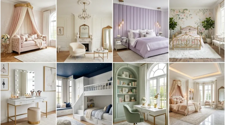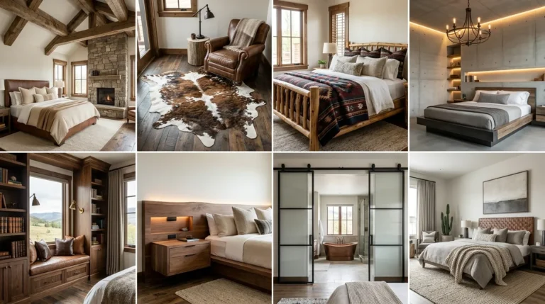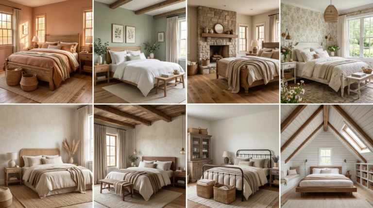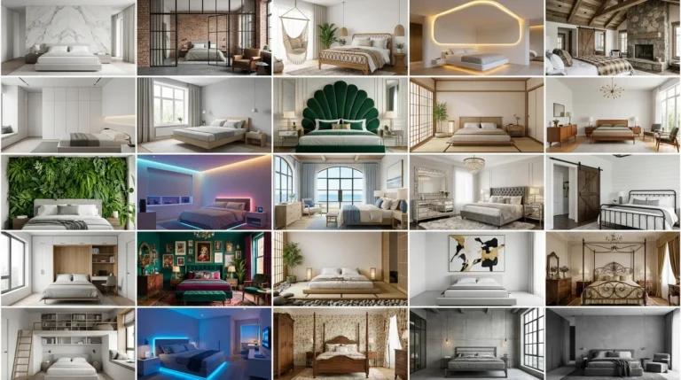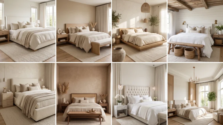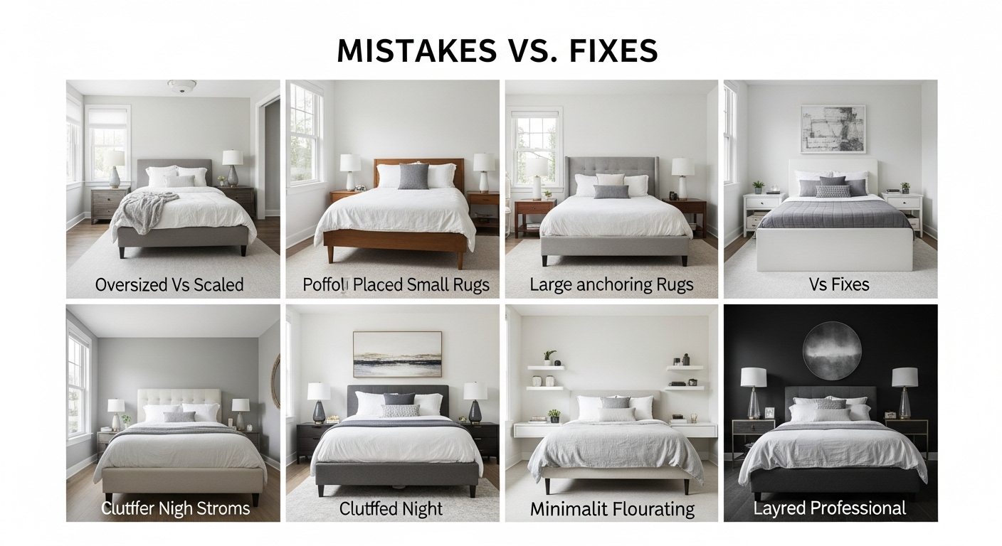
Navigating the constraints of a compact sleeping area is an architectural challenge that requires a shift from simply “filling a room” to “editing its volume.” In 2026, the most significant Small Bedroom Layout Mistakes often stem from a lack of intentionality regarding the room’s “Background Architecture.” When we clutter a space with heavy, free-standing furniture and blocked walkways, we disrupt the “Visual Silence” necessary for a restorative sanctuary. High-end designers avoid these pitfalls by integrating storage into the structural bones of the home—utilizing seamless built-in wardrobes, Roman clay walls, and “Zero-Waste Geometry” to create a sense of expansive, modern luxury. By identifying where your layout fails to breathe, you can implement “Warm Modern” solutions that restore flow and light. This guide explores the most common errors and the sophisticated designer fixes that anchor your home in a state of curated peace, utilizing sensory details like fresh pomegranates in wooden boxes and the singular elegance of a long-stemmed flower in a half-filled glass.
1. Pushing All Furniture Against the Walls
One of the most common mistakes is the “perimeter push,” where every piece of furniture is forced against the walls in a desperate attempt to create floor space. Architecturally, this actually highlights the room’s small boundaries and creates a “Visual Noise” that feels cramped rather than open. Designers fix this by slightly pulling furniture—like a low-profile walnut bed or a cognac leather chair—away from the walls to allow the air and light to circulate behind the piece. This creates a sense of “Visual Flow” and makes the room’s limits feel less rigid and more expansive. The background architecture of textured Roman clay walls then gains depth through “micro-shadows,” turning a flat wall into a sophisticated, sueded canvas. By allowing furniture to “breathe,” you establish a “Collected and Creative” layout that feels twice its actual size.
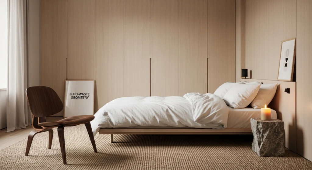
2. Choosing a Bed That’s Too Large for the Room
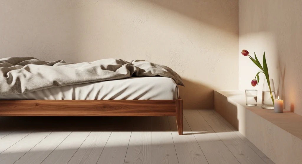
The scale of your bed is the primary driver of a room’s success; selecting a king-sized frame for a compact room is a structural error that destroys “Zero-Waste Geometry.” A bed that touches three walls leaves no room for the architectural layers that make a room feel like a high-end sanctuary, such as proper walkways or floor-to-ceiling cabinetry. Designers opt for a low-profile queen or full-sized frame in white oak, which preserves the vertical volume and maintains a “Clean and Calm” horizon. To ground the space without adding bulk, we style the area with “Active Decor”: a rustic wooden box holding specialized bulbs and a single burning beeswax candle. This disciplined approach to scale ensures the room remains a sanctuary for rest rather than a storage unit for a mattress, allowing the light to highlight the grain of your wood floors.
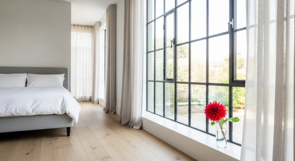
3. Blocking Natural Walkways and Visual Volume
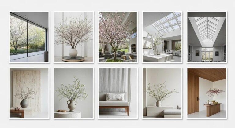
A layout that forces you to navigate an obstacle course to reach the window or the closet is a failure of “Hard Architecture.” Blocking walkways with trunks, benches, or oversized lamps creates a sense of chaos that disrupts the home’s “Visual Silence” and mental clarity. The designer fix is a ruthless commitment to flow; clear all paths and ensure that the most-used routes are wide and unobstructed to the eye. This openness allows the “Sun-Washed” spring light to reach deep into the room, emphasizing the expansive nature of the “Background Architecture.” Style a cleared windowsill or a small ledge with a glass half-filled with water and a single long-stemmed white dahlia. By prioritizing the invisible pathways of the room, you create a sophisticated, high-intent environment that feels architecturally sound.
4. Using Bulky and Heavy Nightstands
Traditional nightstands with heavy drawers and solid bases are “Visual Clutter” that eats away at the perceived floor plane and makes the room feel weighed down. To fix this, designers move toward “Floating Furniture” or minimalist walnut ledges that are wall-mounted, keeping the space underneath clear and visible to the wall. This highlights the architectural continuity of the wide-plank white oak flooring and allows for “Layered Lighting” to be installed beneath the ledge for a “Glowy” evening effect. We style these minimal ledges with “Singular Intent”: a single glass of water, a single long flower, and a slow-burning candle. This shift from bulky to light ensures the bedside remains an organized and inspiring sanctuary, reflecting a lifestyle of high-quality curation and modern, sophisticated discipline.
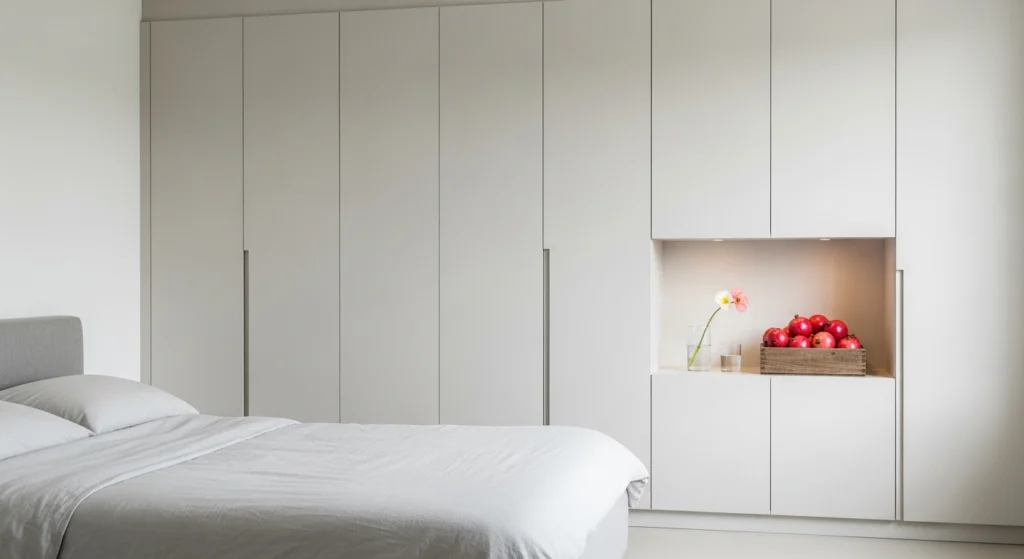
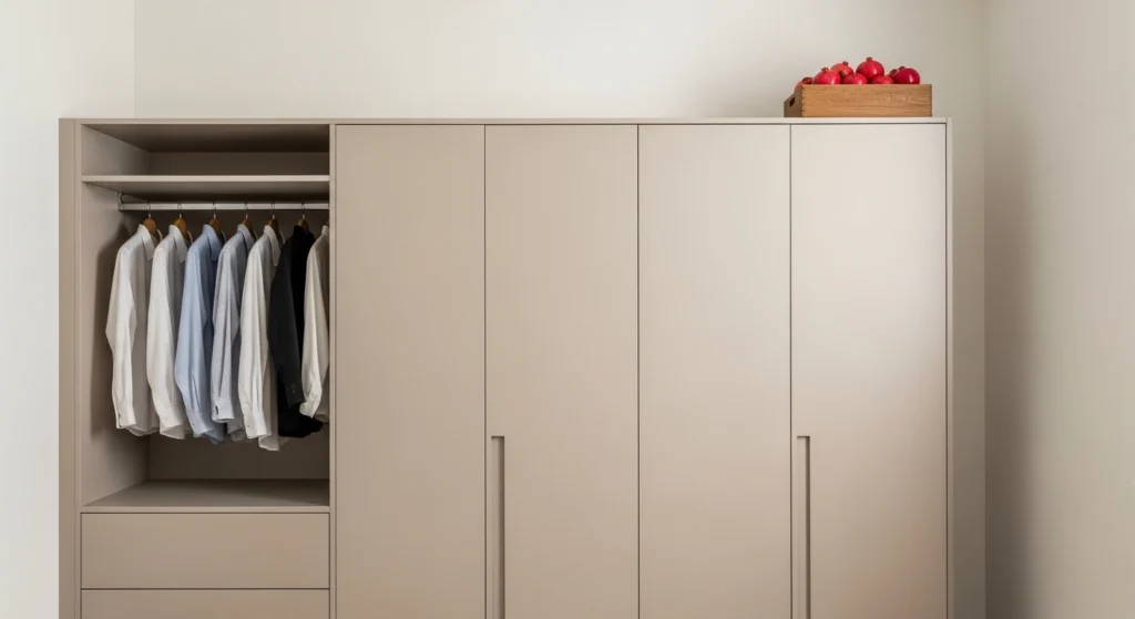
5. Ignoring Vertical Space and Seamless Integration
Forgetting to look up is a major mistake in small bedrooms; ignoring the vertical potential of your walls leads to a cluttered floor and a fragmented room. Designers solve this by implementing floor-to-ceiling “Background Architecture” in the form of seamless built-in wardrobes that span the entire height of the room. By finishing these units in a matte lacquer that matches the Roman clay walls—whether bone, sand, or mushroom—you create a unified architectural plane that hides “life clutter” entirely. This vertical integration makes the ceilings feel higher and the room feel more expansive and purposeful. We style an integrated niche or a high shelf with a wooden box of fresh spring pomegranates, adding a “pop” of organic color to an otherwise “Visual Silence” masterpiece.
6. Too Much Furniture (Even If It Fits)
Just because a piece of furniture “fits” doesn’t mean it belongs; “Over-Furnishing” is a direct violation of the “Zero-Waste Geometry” principle. A small room with a bed, two nightstands, a dresser, and a chair feels heavy and over-saturated, regardless of the quality of the individual pieces. The designer’s fix is “Subtractive Design”—removing everything but the essential architectural anchors to restore the room’s soul. Keep the low-profile bed and perhaps a single “Collected” cognac leather chair, and hide everything else within the built-in cabinetry. This creates “Negative Space” that allows the spring sun to wash the room in a soft glow, highlighting the texture of the plaster and the warmth of the timber. A single burning candle on a stone ledge provides all the decorative weight needed.
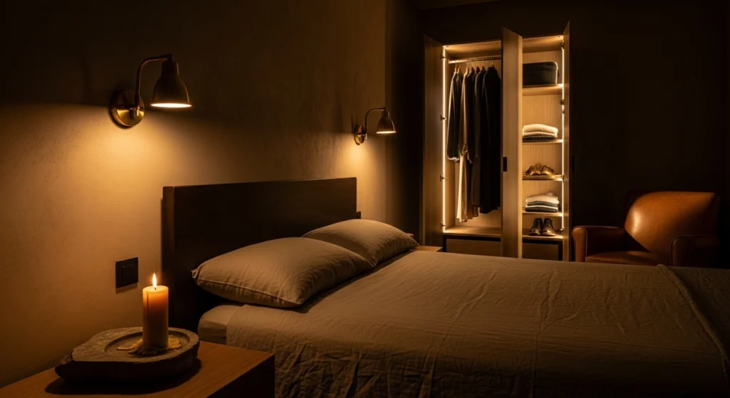
7. Poor Lighting Placement and Lack of Layers
Relying on a single harsh overhead light is an architectural mistake that flattens the room’s depth and makes it feel like a clinical, uninviting box. Designers fix this with a “Layered Lighting” strategy that creates an atmospheric “Glowy and Intimate” retreat perfect for the evening. Combine brass reading sconces with integrated LED strips inside the built-in wardrobes and a single beeswax candle on a side table. This variety of light sources highlights the sueded texture of the Roman clay walls and the grain of the walnut furniture, creating “pockets” of warmth. Placing a glass half-filled with water near a light source creates beautiful reflections that add a layer of “Active Decor” to the space. Proper lighting is the invisible architecture that makes a bedroom feel multi-dimensional.
8. Strategic Storage Strategy vs. Hidden Clutter
Relying on “visible storage” like open racks or overflowing baskets is a mistake that increases “Visual Noise” and ruins the room’s sense of order and luxury. The fix is a high-intent “Storage Strategy” that utilizes the “Background Architecture” to its fullest potential, moving items behind closed doors. Handle-less built-in wardrobes should be designed to house everything from electronics to extra linens, leaving your surfaces completely clear for minimal styling. Style your one visible walnut surface with a rustic wooden box holding specialized bulbs and a single long-stemmed white tulip in a glass of water. This disciplined approach ensures the room remains a “Clean and Calm” environment, where the luxury of “Visual Silence” is protected and the homeowner can truly relax.
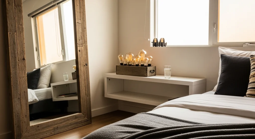
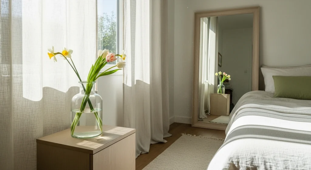
9. Centering Everything Perfectly and Lack of Movement
While symmetry can create order, centering every single piece of furniture perfectly can make a small room feel static, rigid, and “staged.” Designers introduce “Visual Movement” by styling with asymmetrical intent—placing a large leaning mirror with a rustic timber frame in one corner and an organic-shaped stone vase on a side ledge. This breaks up the hard lines of the room and draws the eye across the space, making it feel more expansive and “Collected.” We style these asymmetrical moments with “Active Decor”: a wooden box of fresh pomegranates and a single burning candle. This creative energy prevents the room from feeling like a sterile showroom, grounding it in a “Warm Modern” soul that reflects the unique personality of the inhabitant.
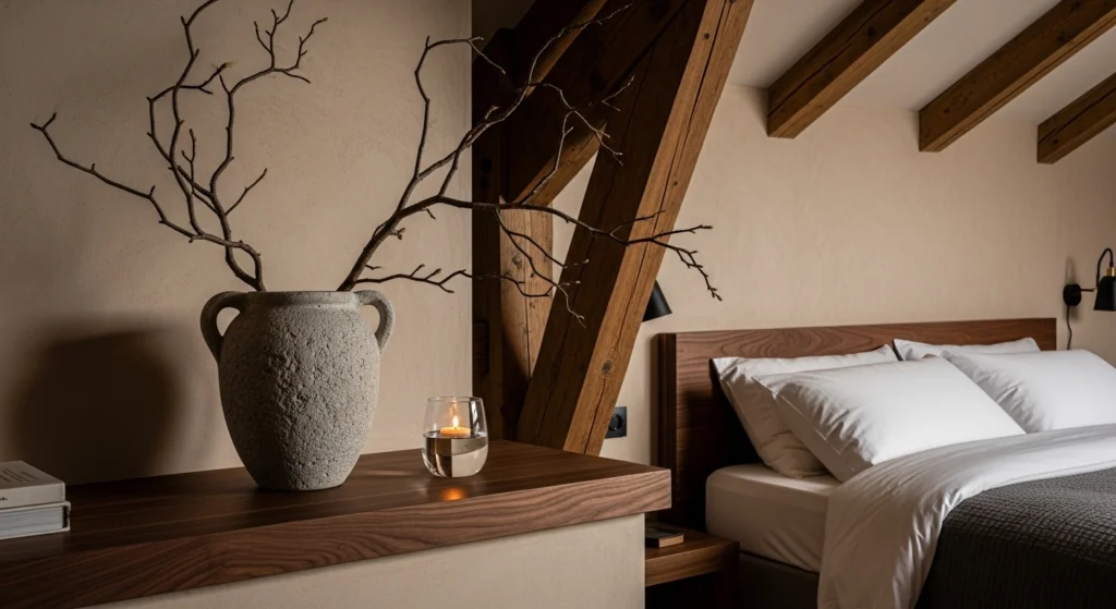
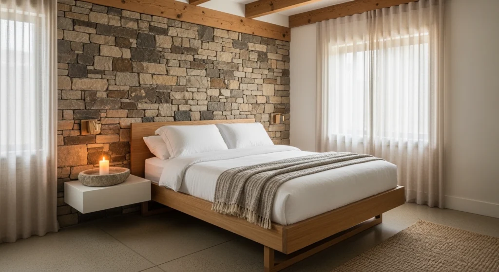
10. Forgetting About Visual Weight and Heavy Materials
Using heavy, dark, and opaque materials in a small room can make the “Visual Volume” feel suffocating and the atmosphere feel stagnant. Forgetting to balance the “Hard Architecture” with “Soft Soul” is a common error that designers avoid through careful material selection. Designers fix this by choosing materials with a lighter visual weight—sheer linen drapes, clear glass vases, and furniture with slender white oak legs. This allows the spring light to pass through and around objects, creating a sense of sun-washed clarity and openness. On a stone ledge, a single glass half-filled with water holding a wildflower creates a sense of lightness and transparency. By prioritizing materials that feel airy and optimistic, you ensure your compact sanctuary remains a retreat that feels twice its size.
Final Thoughts: Small Bedrooms Aren’t the Problem
Ultimately, the success of a compact space lies in the realization that small bedrooms aren’t the problem—the layout and the “Visual Noise” we introduce are the true obstacles. By pivoting away from standard furniture Placement, arrangements, and leaning into the power of “Background Architecture,” you can transform any footprint into a high-end sanctuary. The most sophisticated rooms are those that embrace “Visual Silence,” utilizing seamless built-in wardrobes and Roman clay walls to create a canvas for a “Collected and Creative” lifestyle. When you replace bulky nightstands with floating ledges and trade heavy drapes for sheer linen, you allow the room to breathe and the light to lead. Your home should be a reflection of your intentionality; by avoiding these common mistakes and focusing on grounded materiality, you create a “Warm Modern” retreat that is as architecturally sound as it is deeply restorative.